
UX DESIGN PROJECT

PROJECT OVERVIEW
Atlantis Delivery is a mobile app that provides an on-demand delivery service for grocery and market store items from Atlantis Fresh Market Stores in USA and Canada. The grocery delivery app has been in the market for 2 years and has gained a considerable user base. However, the app has been receiving negative feedback from users for its outdated design, slow performance, and limited product range. The company decided to redesign and upgrade the app to improve the user experience and attract more customers.
Role
Time
Collaboration
-
Research
-
UX/UI design
-
Prototyping
-
Ceyda Elçi
-
Efe Cömert
-
Oğuzhan Çetinkaya
4 months
PROCESS


01
RESEARCH
User Inverviews
User research focused on user needs, motivations and their feedbacks. We followed a research method (Quantitative Analysis) to detect the first hand problems from users perspective. We target the participants who use Atlantis app for a quick interview to understand the difficulties they face and what changes they specifically need in the application. In this user research method we focused on deep diving especially to pain points and requirements.
Some of the questions are:
-
Age
-
Occupation
-
How frequently do you use the market applications?
-
Which market delivery apps do you like the most on usability perspective?
-
What do you like about the Atlantis app?
-
Do you find it difficult to find a product you’re interested in?
-
How long does it take you to get a desired product you want to buy?
-
Are there any reasons for you to quit shopping?
-
Any suggestions or feedback on how the app could be improved?
-
Will having an improved search bar, product navigation make you shop faster and easier?
-
Is there anything else you would like to add about your experience using market delivery apps?
Key findings from interviews:
-
Convenience was a major factor for users when it comes to using market store delivery applications, they find it very convenient to order groceries and have them delivered to their homes.
-
Users valued the wide variety of products that were available on the app, including fresh produce, meat, and household essentials.
-
Many users requested features such as the ability to save previous orders, schedule delivery times and track their orders in real-time.
-
Many users found the customer service to be helpful, but some users suggested that there could be more ways to reach customer service.
-
Most of the users were satisfied with the convenience and time-saving aspect of the app, and appreciated the ability to order groceries without leaving their home.
-
A lot of users suggested that there could be a better way to navigate through the app and find the products they want more easily.
-
Users also wanted more payment options such as debit/credit cards, mobile payments etc.
-
Some users were looking for a way to reach to more deals and discounts on the app.
-
Overall, users suggested areas for improvement, such as usability issues, overall shopping experience.
Stakeholder Interview
The problem statement from stakeholders was users spend much time on app because of the categorizing system that they have is working poorly, on the search page they are looking for a particular product but the search results bring irrelevant products to the user, the products brands are not well categorized for easy selection, and poor search navigation making the user go to certain screens to to make a product search or poor product accessibility. The branding and the style of the app is not convenient for their re-branding.
02
IDEATE
Personas
After having number of user interviews and researching on demographics of our users we had a variety of user profiles and information about their choices, preferences, habits, goals, needs and pain points Later on we come up with two different personas that will guide our design decisions along the way. Based on these different profiles we decided to ideate our design solutions.


Competitor Analysis
Competitor analysis research made on the most successful brands and their most used features. This research made with different popular products in different regions and to understand what made them stand out. This process involved a deep-dive analysis on their user flows and understanding the user needs in their region and how they answer those needs within the app.

Atlantis Existing UX Audit
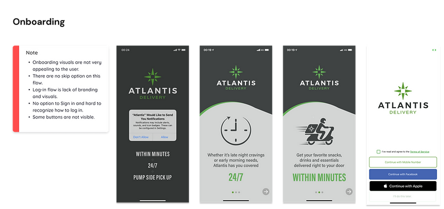
A deep dive analysis made on existing user flows, screens and components to detect the problems within the app. Core flow analysis showed us there are some fundamental UX UI problems exist in app that need an immediate fix. We focused on onboarding, login, home page, category page, product detail page, cart and checkout pages.


Some of the existing features and user flows are examined and grouped as how they provide a user experience and rated between positive or negative experience. This rating chart is created based on user interviews, competitors and heuristic approach from the professionals.

Key Issues and Design Decisions
According to our research and ideation materials we defined some key issues and solutions to those issues below on the chart. We decided to focus on these fundamental issues when starting the re-design process. After carefully analyzing the research findings, we started ideating solutions that could address the identified pain points. Our primary focus was to simplify the app's interface, improve performance, and streamline the checkout process. We came up with the following issues and solutions:

03
DESIGN

Information Architecture
Style Guide/ Design library

UI Design


Sign up page created based on simple UI design principles. Address search bar positioned at the bottom for easily reached by finger tap.

Accessible promotion
Floating cart button
Accessible address section
More categories with smaller cards

Users can be able to track their delivery on the home page and got a notification when they received their order.

Smaller card component used on the category page to use the space efficiently. Sub-categories are accessible with scroll down or swiping the chips below. Product detail page set up to be more informative having both the product detail and nutrition sections.

Users can see their search history and popular searches around their regions. On the search results screen incase they couldn't find what they want users can suggest a product they want to order.

Users can add more or remove the products easily on the cart page. This page is the last area we can reach the users before the checkout so there is suggested products take place in here according to their previous orders.

In order to remove the clunky UI components, very simple and plain components used on the checkout page. Users can track their orders from the Track Order page and contact the support via text or a call.

Users can access 7 different actions from their profile page. Wallet, Address, Vehicles, Order history, Refer a friend, Contact Support and Logout.
04
PROTOTYPE & TESTING


05
ATLANTIS DELIVERY FINAL DESIGN SCREEN RECORDING


